One Business, Everywhere: How I Built Bellmark’s Look and Voice
Audit & Foundation · Brand & Voice · about 6 minutes
I launched Bellmark on a simple site so I could start taking work while I built the brand. When I later audited my own channels, my Facebook page, LinkedIn page, Google listing and website were describing four different businesses. This is how I fixed it, and the written standard that keeps it fixed.
Before you read on
If your website, Facebook page and Google listing each describe your business differently, customers notice before you do.
The short version
- I launched on a simple site on purpose, to get Bellmark open for business before the brand was finished. An audit of my own channels later found four positioning lines and three visual styles.
- I wrote a brand standard before designing anything: palette, type, one mark, one positioning line, one voice, and rules for where each one goes.
- I rebuilt the site and every profile to that standard. I used AI to plan the shot list and edit the images, which cut the cost and time of a traditional production.
- The standard is documented and built into templates, so every new post, banner and page comes out consistent without anyone redesigning it.
The audit
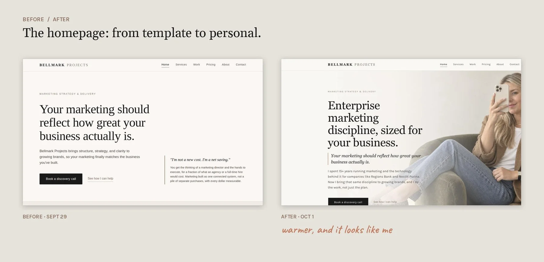
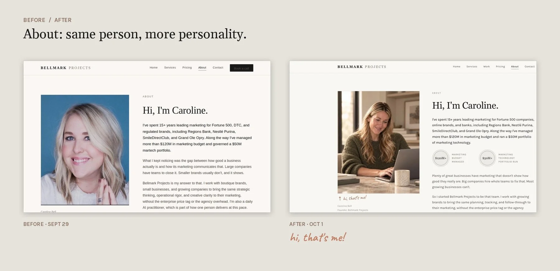
I launched the first version of the site to get Bellmark live and taking work while I built the brand behind it. That was a deliberate call, and it's the same one I'd make for a client: a business shouldn't wait on a perfect website to start selling. The site was clean and correct. It also looked like a template, with a headline on a plain page, no photography, and an About page headshot on a blue background that matched nothing else.
Once the business was running, I ran the same audit I run for clients, starting with how my own channels described the business. I found four different positioning lines:
- Facebook cover: "Marketing that matches the business you've built."
- LinkedIn banner and Google cover: "Fractional marketing for growing brands."
- Welcome post: "Strategy, structure, and clarity."
- Earlier profiles: "Marketing operations & program management."
Each one was accurate. Side by side, they read like four different companies. The graphics had the same problem: dark, text-only cards in three different layouts, with nothing to show there was a person behind the work. For a solo consultant, that person is what the client is buying.
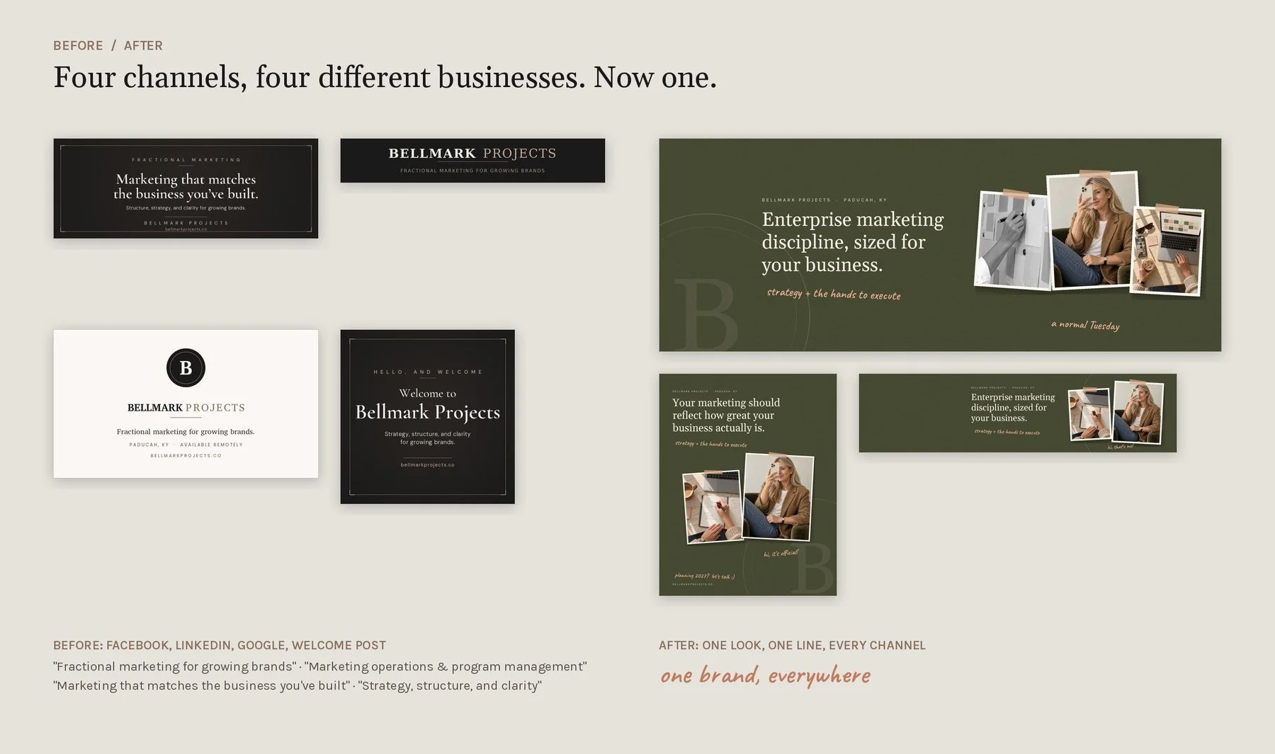
None of this was broken, which is why it's easy to leave alone. But every inconsistency is a small cost. A customer who checks your website, then your Facebook page, then your Google listing, and gets three different descriptions, trusts you a little less. It's a common pattern, usually because each channel was set up at a different time by a different person.
The standard came before the design
The root cause wasn't the graphics. There was no written standard, so every new asset was a fresh decision, and the decisions drifted. That's true at a Fortune 500 company with a brand team, and it's true for a business of one. So I wrote the standard first and designed against it.
Palette. Ink (#1A1A1A) and cream (#E5E3DC) carry most of the work. Bronze (#8B6F5E) is the only accent on light backgrounds, used for labels and rules. Olive and terracotta are secondary colors with defined uses, so warmth comes from the system instead of from whoever is making the graphic that day.
Type. A serif for headlines that's web-safe, so there's no font license to manage or renew. A clean sans for body copy and labels. A handwriting accent with a hard limit of a few short notes per page. No fourth typeface.
The mark. A single serif B inside a ring, with a written minimum size, clear-space rule and a list of things never to do to it. I chose a monogram over the full logo for a practical reason: social platforms already print the business name in bold beside the profile picture, and a full wordmark shrunk to a 40-pixel circle is unreadable. The full wordmark runs on cover images, where there's room to read it.
One positioning line. "Enterprise marketing discipline, sized for your business." One line on every profile. When a platform has a character limit, I cut from the end and never rewrite. The line went through a few versions before I settled on it; the rule is what keeps it from drifting again.
Placement rules. One link destination on every profile. One avatar file across Facebook, Instagram and LinkedIn. A written note on which line goes where (more on that below). Most brand drift doesn't come from bad taste. It comes from small decisions nobody wrote down.
The voice
Voice gets the same treatment as visuals: written rules, applied everywhere, checked after.
First person, everywhere. Bellmark is one person, and the person who sells the work does the work. "We" would make the business read like a small agency, which is exactly what my clients are trying to avoid paying for. So "I" was part of the standard from the start, and I checked every asset against it as I built it, from page copy and case studies to banners and posts.
Plain business-owner language. I write the way I'd explain a finding in a leadership meeting to someone who doesn't work in marketing. For example, "Your ads were paying for clicks that never turned into customers" instead of "optimizing funnel efficiency." I review every piece of content before it goes out to make sure anyone reading it can understand it, whether or not they work in marketing.
Rules against copy that sounds machine-written. No em dashes, no stock phrases, and none of the "it's not X, it's Y" constructions. When I use AI to review my content, I check every edit it suggests and make sure none of those patterns slip in. The copy should read like a person talking to a business owner.
Which line goes where. "Your marketing should reflect how great your business actually is" speaks to how an owner feels, so it leads the homepage and the social posts. "Enterprise marketing discipline, sized for your business" says what I do, so it goes on banners and profiles. Writing that down ended the habit of rewriting both every time.
Look and feel
The creative direction had one job: keep the structure the site already had and add proof that a real person runs the business. I translated that into specific, repeatable choices: candid moments, hands in the frame, overhead shots of a real workday, black-and-white details and hard window light.
On the site, that became:
- A homepage hero photo in place of a headline on a blank page
- Olive section bands with a faint film grain, and the ring-B mark cropped large in the background
- Photo prints styled as if taped to the page, with short handwritten notes
- A "Behind the work" strip of detail shots from a normal workday
- The client quote set as a paper card instead of a gray quote block
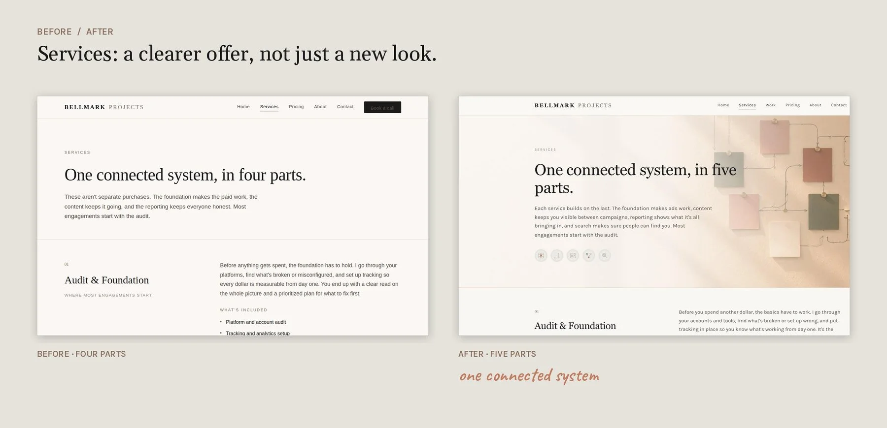
I also rewrote how the services are explained. I added a fifth service, Search & AI Visibility, and the Services page now shows how the five connect: the foundation makes the ads work, content keeps you visible between campaigns, reporting shows what it's all bringing in, and search makes sure people can find you. New colors on an offer that's hard to follow would have fixed only half the problem.
Creative direction and imagery
A traditional route would have meant a photographer, a stylist and a retoucher. A half-day brand shoot typically runs $1,500 to $5,000 before retouching. For most small businesses, that cost is the reason the website keeps the same stock photos for years.
I used AI for two parts of the process.
Planning. I used it to work through the shot list and creative direction from the mood board: which moments to show, what goes in the frame and what stays out, and which spot on the site or which post each image is for.
Editing. Cleanup and consistency edits that would normally mean a retoucher or a reshoot, such as matching surfaces across images, keeping details consistent from image to image, and fixing small problems without starting over.
Quality control came from a written spec every image had to pass. Desks are cream travertine, never wood. No plants. The same palette in every image. If an image failed the spec, it got fixed or it didn't ship.
The outcome was a full image set for the site and every social channel for far less money and time than a traditional production. Because the spec is written down, the next image will match the last one.
The build
- The website. Custom-coded pages on a standard website platform, so it looks custom but stays easy to own and update. Every page change was made with a saved rollback version, so nothing was ever one bad edit away from broken.
- Profile banners for LinkedIn, Facebook and Google, built from one layout, one line and one palette.
- A five-template graphics system for social: a taped photo, a note card, a checklist carousel, a case study card and a photo with a caption. Every post starts from a template, so a new post never needs a new design.
- A social assistant that drafts in the brand voice. I plan the content strategy myself and write it down: what each month covers, what each post needs to say, and which channel it's for. The assistant takes that plan and turns it into drafts for each platform, following the documented voice rules and using the right line in the right place. It runs as an AI agent on a schedule: every Monday it drafts the week's posts into my scheduling tool, and every Friday it logs what went out and how it did. Nothing goes out until I approve it. I can set up the same system for clients, so the routine work of keeping a social calendar full is automated while the strategy and final approval stay with you.
What a client gets from this
- An audit of how every channel describes your business today, side by side
- A written brand standard: palette, type, mark, positioning line, voice and placement rules
- Your website, social profiles and Google listing brought in line with it
- Templates your team can use without hiring a designer every time
- If you want it, an AI agent that keeps your social calendar maintained: drafting posts from your plan, in your voice, for your approval
- Your accounts and files stay yours
This usually comes up during an audit. When I go through a business's marketing, the brand is often working against the ads, the website and the content. When it is, a Brand & Voice Refresh is the next step, and I quote it per project.
Sound familiar?
Does your marketing look like four different businesses?
If your audit shows your brand is working against your marketing, this is the work I do next. It usually starts with a short conversation.
Start a conversation